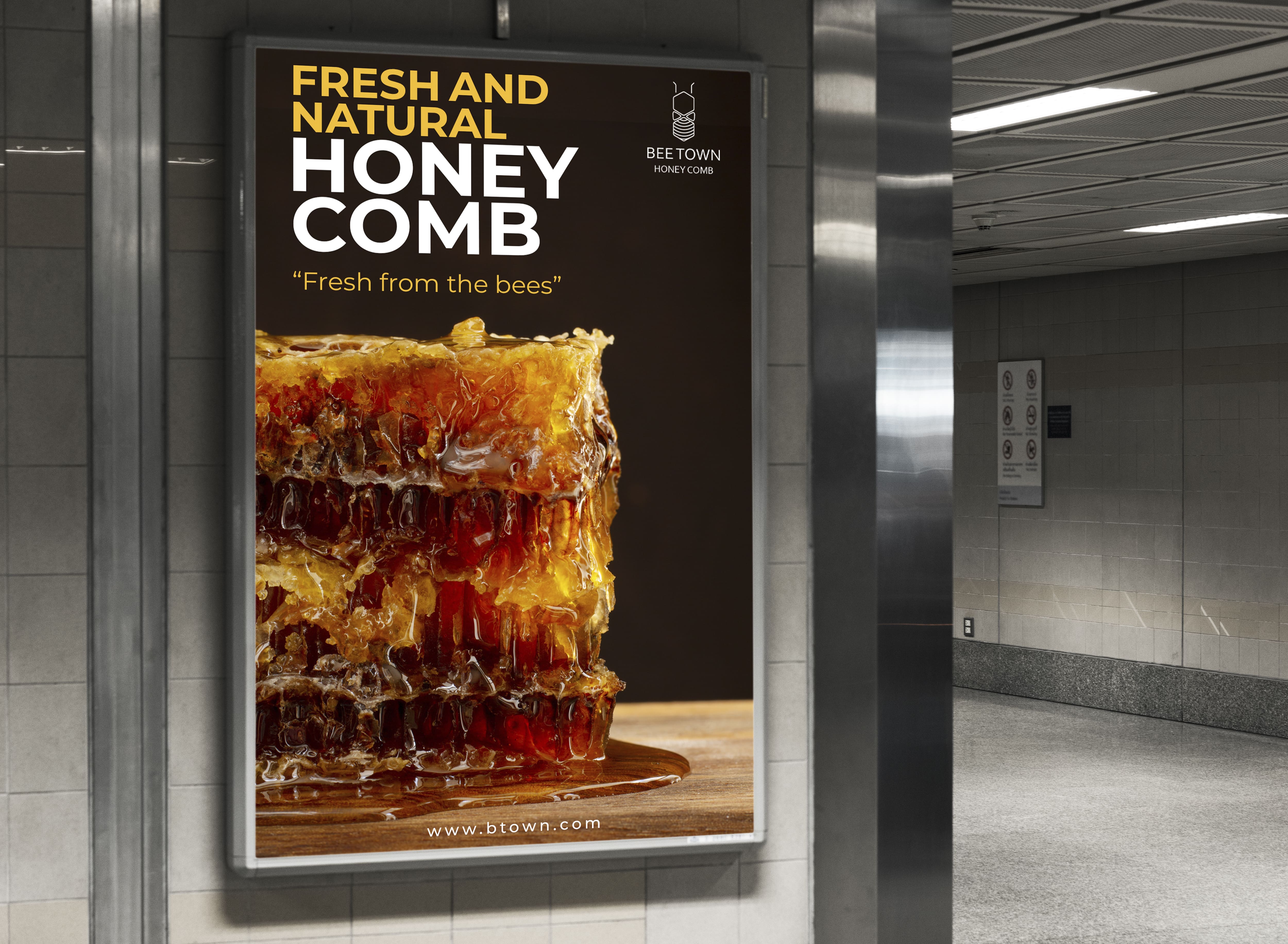
Bee Town Branding Project

Role: Concept Creator and Branding Designer
Team: Individual Project
Tools Used: Adobe Illustrator, Photoshop
Objective
The goal was to create an innovative product idea and build a cohesive brand identity. I developed Bee Town, a brand for raw, unprocessed honeycomb that is 100% natural, organic, and fresh. The project aimed to emphasize purity, sustainability, and the unique appeal of honeycomb over traditional honey products.
Brand Name & Logo
Name Origin: "Bee Town" symbolizes the natural habitat of bees and reflects the organic and pure nature of the product.
Logo Design: The logo incorporates elements of a bee and a honeycomb, capturing the essence of the product’s origins and purity.


